To view system status and access the Dashboard menu:
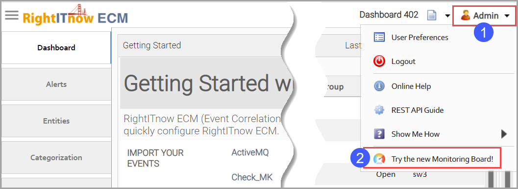
ECM 6.0 introduced a new monitoring board that you can use in addition to the classic dashboard described in this section. The board offers enhanced views into alerts, user activity, and system health. It includes an innovative Alert Heatmap that conveys at a glance the areas in your infrastructure requiring the most attention.
To view the new monitoring board:
Navigate to http://<ecm>:8080/rightitnow/ecmjs/.
Or
Select it from
the User Menu:
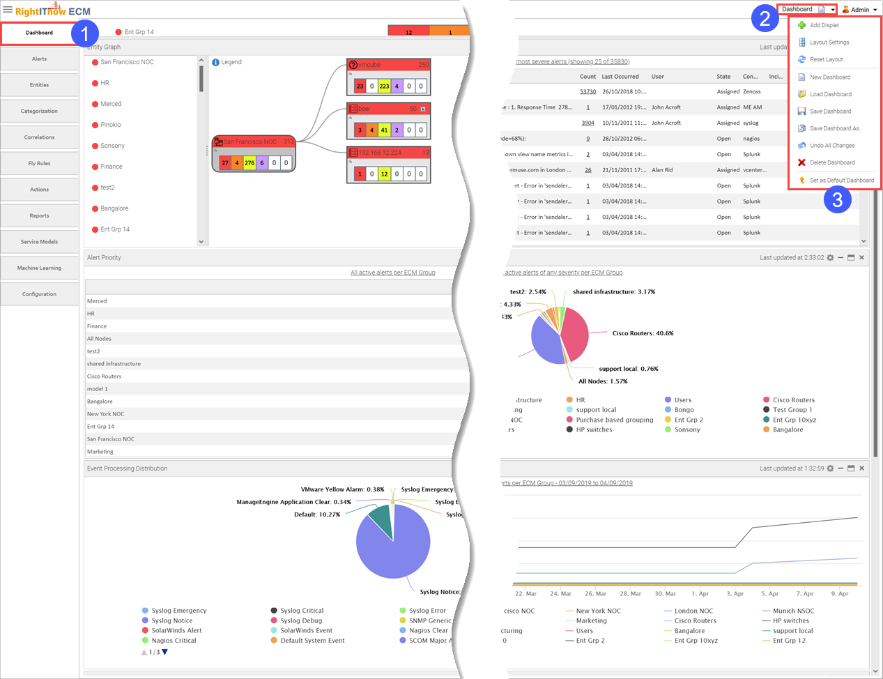
The Dashboard contains displets that graphically describe system status. The following topics describe the default displets.
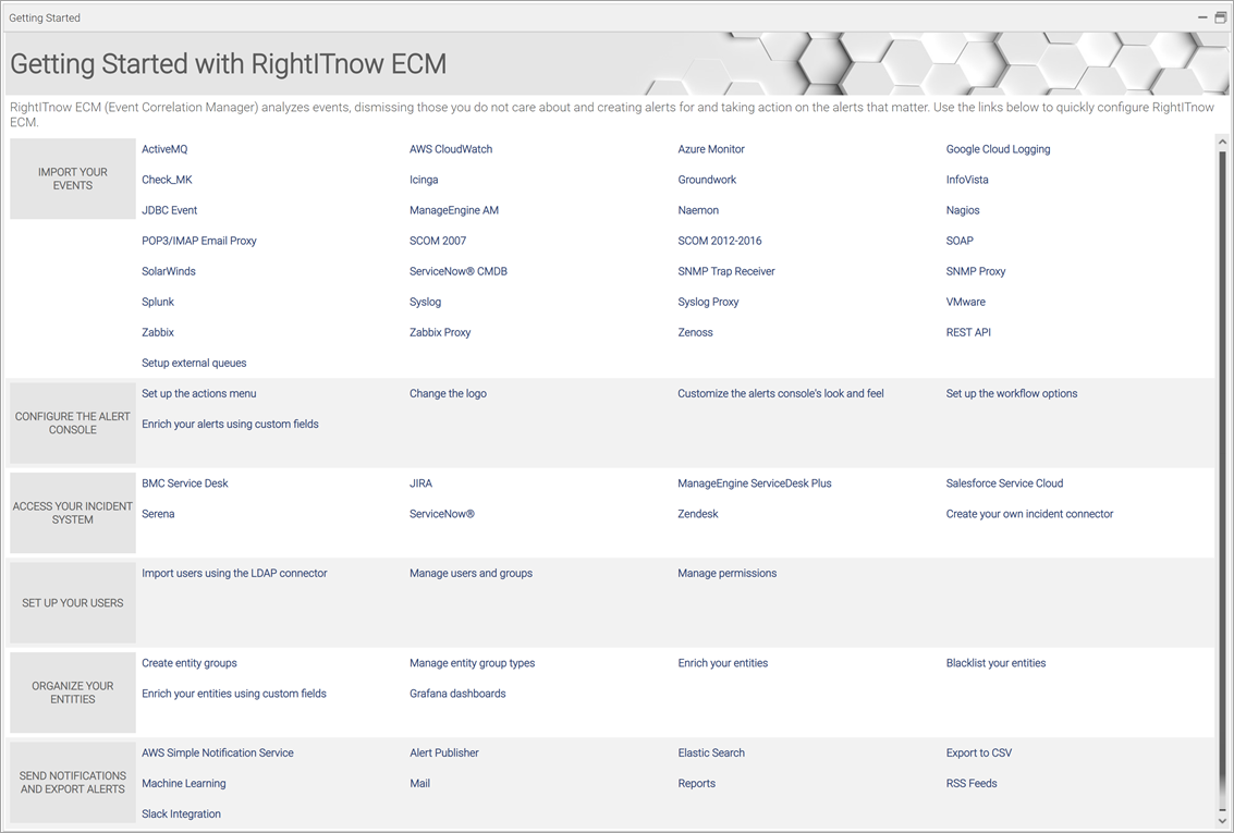
The Getting Started displet is a wonderful place to start with RightITnow ECM. It contains links to downloads and accompanying documentation you use to plan and execute your ECM environment, and integrate it with third-party applications.
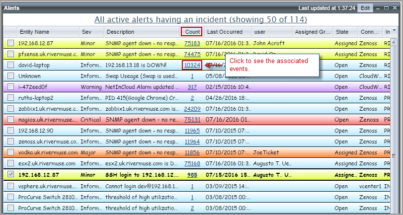
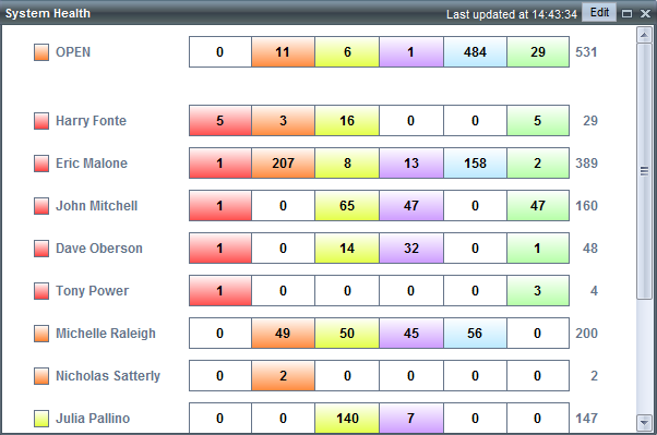
A mini version of the Alerts tab that displays alerts specified by clicking Edit in the upper-right corner. Double-click an alert to move directly to the Alerts Console. Right-click an alert to invoke the Context Menu.
Click Edit in the upper-right corner of the displet to:
Configure the displet to display recent alerts, most severe alerts, open alerts, alerts with most events, or alerts having the most incidents.
Change the number of alerts displayed and the refresh rate.
Apply filters to the alerts displayed in the displet.
Move to the alerts console when double clicking alerts.
Show lead alert marker and hide rolled up alerts.
Click a value in the Count column to view associated events:
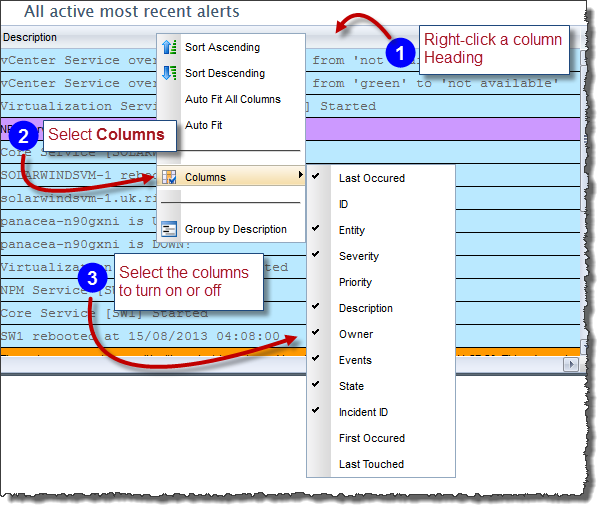
To select columns for this displet:
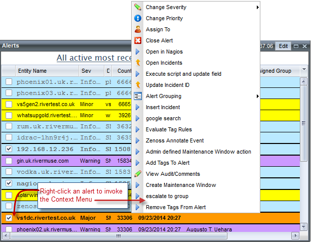
You can control who can see the context menu using the following Permissions control, as described in Managing Permissions:

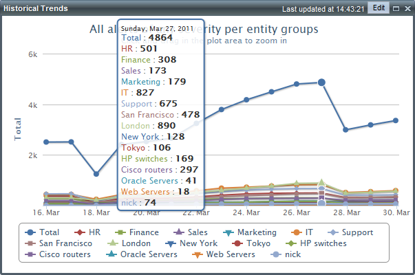
Displays a history of alert trends over time. Click
Edit in the upper-right corner
of the displet to configure the displet to display alerts against entity
groups, services, or users. You can also specify which severities to display
and the refresh rate.
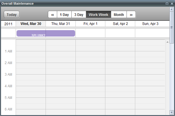
Indicates which devices are under maintenance.
Provides
an area for displaying web link of your choosing, for example a link to
an internal portal or an external RSS feed. Click Edit in
the upper-right corner of the displet to enter the web address of the
web page to be displayed in the displet.
Illustrates the number of alerts in the system, displayed
per selected entity group. For each entity group, you can view a distribution
of the severity of all the alerts. Click Edit
in the upper-right corner of the displet to configure the displet to display
alerts against entity groups, user groups, services, or users. You can
also specify which alert states to display and how to sort the data, and
the refresh rate. For comparisons, Use the Edit
button to access the Alert filter
drop-down menu that alters the chart to display the appropriate Show Against data against the subset
of alerts provided by the selected filter
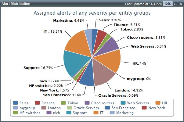
Displays in a pie chart the distribution of
alerts of any severity per entity groups. Click Edit
in the upper-right corner of the displet to configure the displet to display
alerts against entity groups, services, or users. You can also specify
which alert states and severities to display, and the refresh rate. Use
the Edit button to access the
Alert filter drop-down menu that
alters the pie chart to display the appropriate Show
Against data against the subset of alerts provided by the selected
filter.
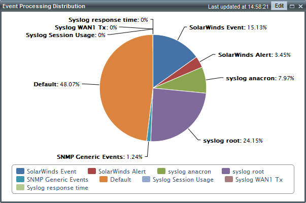
Graphs in a pie chart the amount of system processing
used by the specified event type or system entity. Click Edit
in the upper-right corner of the displet to select which items to graph
against and to configure the refresh rate.
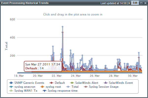
Displays a history of event processing trends over
time. Click Edit in the upper-right
corner of the displet to select which items to graph against and to configure
the refresh rate.
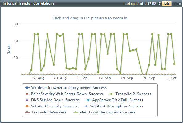
Presents historical correlation data so that you can gauge the effectiveness of your correlation rules. Which ones are reducing your workload? Which ones could use some revising to provide more correlations?
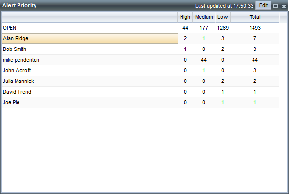
Displays the alert priorities distributed across
users, user groups, entity groups, or services. Who is overloaded
with high priority issues? Which services are most problematic? Which
entity groups are most stable and could perhaps have Operators pulled
off of them and onto more worrisome entity groups?
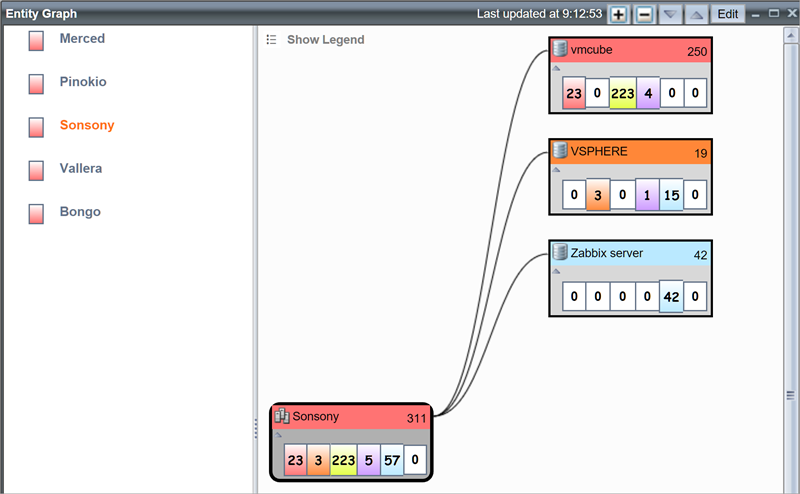
Provides an easily accessible graphical visualization of the entities and entity relationships within an entity group. Also shows the entity or group health and an alert breakdown for each node .
Click Edit to:
Control which entity groups' graphs can be loaded in the display
Filter or sort the entities in the graphs
Show entities with no alerts
Include alert count from sub-groups
Control node spacing and nodes per page
Set the refresh rate
Specify where to show alerts when an item is clicked within the displet:
Alerts Console: switches to the alerts tab and applies filtering to show the alerts.
Alerts Displet: shows the alerts in the selected alerts displet on the current dashboard.
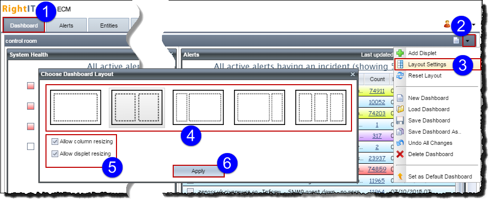
You can select a layout for the dashboard from a set of templates; and drag displets to new positions, turn them on and off, and minimize and maximize them.
You can control the layout of the dashboard by applying a set of templates, and you can allow or disallow column and displet resizing.
To apply a dashboard layout:
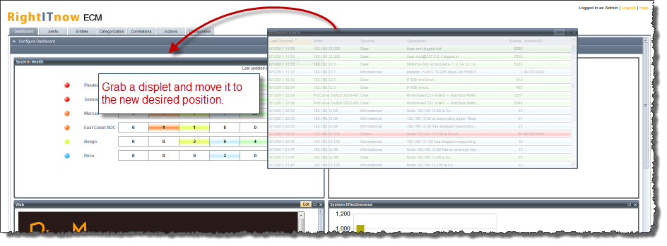
You can reorganize the displets on the screen by dragging them into different positions:
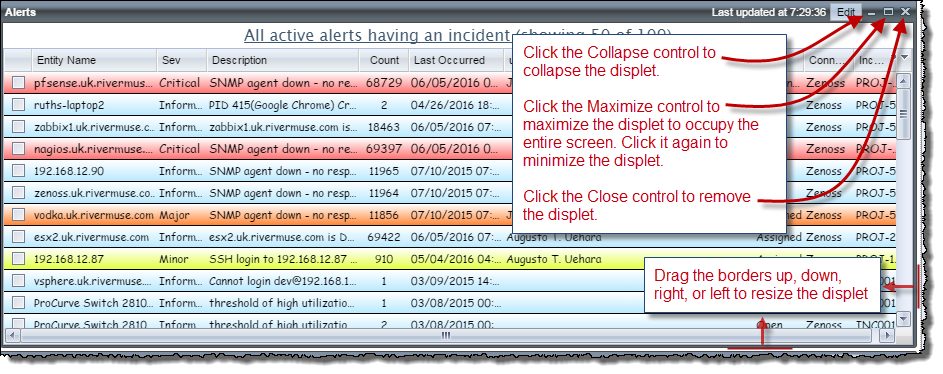
Maximize, minimize, resize, and remove displets as follows:
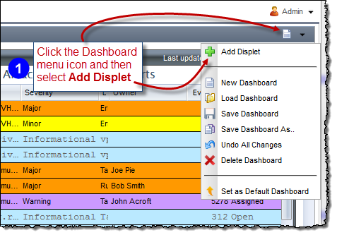
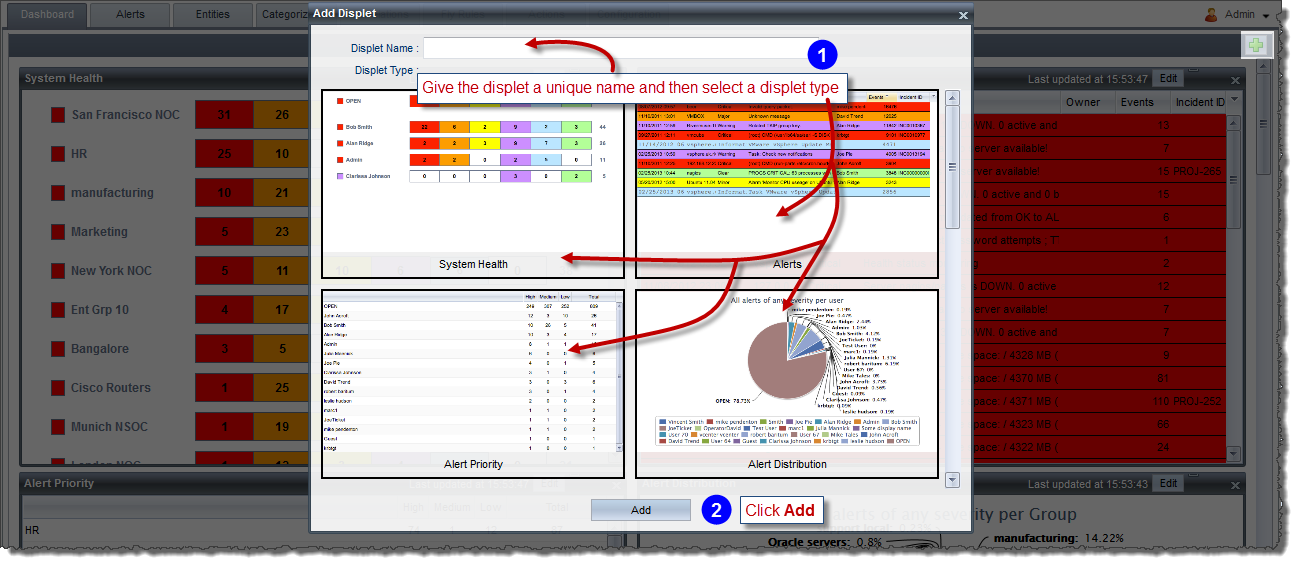
You can add as many displets of the same type as you like. Give each displet a unique name when creating it.
To add a displet:
And then:
To rename a displet:
Click Dashboard.
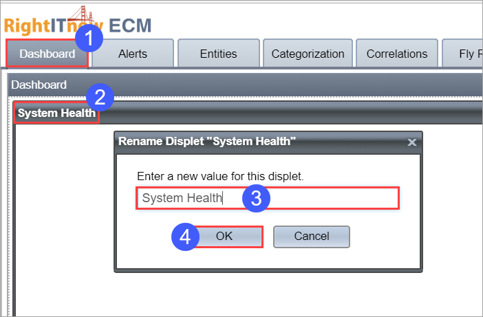
Double-click the displet to rename.
Configure the new name.
Click OK.
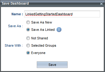
You can save multiple dashboards and keep them to yourself, or share them with everyone, or specific groups.
To save a dashboard, configure the dashboard to your liking, and then:
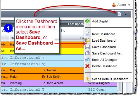
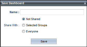
Then supply a name and select the distribution on the resultant dialog box:
You can save a dashboard configuration that is linked to the current dashboard, reflecting current settings, and allowing you to change the visibility, order and size of grid columns on the Alerts displet, and the sorting, freezing and grouping of the grid on the Alerts displet. This is in contrast to saving an unlinked dashboard that is completely modifiable.
In summary, you can modify the following attributes of a linked dashboard:
For the Linked option to be available, the current dashboard must have already been saved.
To save a linked dashboard:
The Save Dashboard As.. dialog box appears:
To enforce a common dashboard for all users, configure the dashboard to your liking, and then:
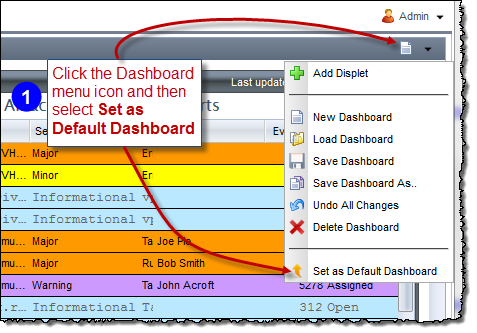
The Set as Default Dashboard setting saves the current settings as a default for all other users. If you do not see the option, then you may need the permission to access the button. By default, only Admins have this permission. Also, there is another permission, by default available only to Admins, that allows users to change the settings enforced by the Set as Default Dashboard setting. See Managing Permissions.